You want to learn lettering, calligraphy and more? Welcome to lettering.org – your ressource to learn creative techniques to create stunning artworks.
I will teach you how to letter step by step. So stop scrolling on Instagram or Pinterest and start your very own lettering journey now.
The tutorials will help you to create awesome results. You will produce simple letterings as early as possible to celebrate first successes. Lettering.org will guide you through the jungle of materials, tools and techniques.
Contents
Start your lettering journey today
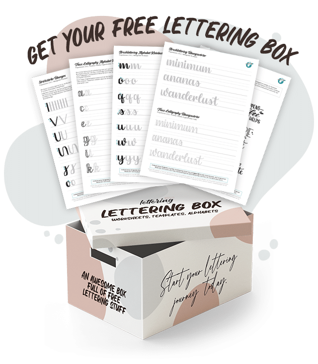
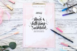
The lettering box contains high quality worksheets, templates and alphabets.
Get the lettering box for free by signing up for the lettering.org newsletter now.
How to become a lettering artist
So how to become a hand lettering artist? Follow three simple steps:
- Start sooner than later. The best time is now!
- Use the most basic tools (or what you have at home) to make your first experiences.
- Alway keep on creating and you will succeed!
On my website you will find everything you need to learn lettering faster and better.
Once you made your first steps in the world of calligraphy you will have a completely new view on letters. And you will love it. Trust me!
Start your lettering journey now. Use my tutorials, worksheets and tools to learn it fast, effective and with a lot of fun!
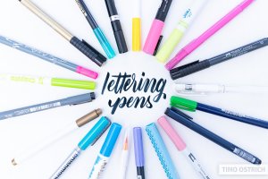
Basic tools you will need
I always say that the tool does not make the craftsman, but especially in hand lettering a certain basic equipment is very helpful!
Of course you have the possibility to start with what you have at home. You will certainly have a few pens and some paper. With this you can already do a lot more than you would expect!
If you want to learn brush lettering you will need a so called brush pen. Basically that is a great combination of a pen and a brush. The pen tip is flexible and therefore pressure sensitive. This means that the harder you press down, the thicker the line becomes. Just like a brush but way better to handle.
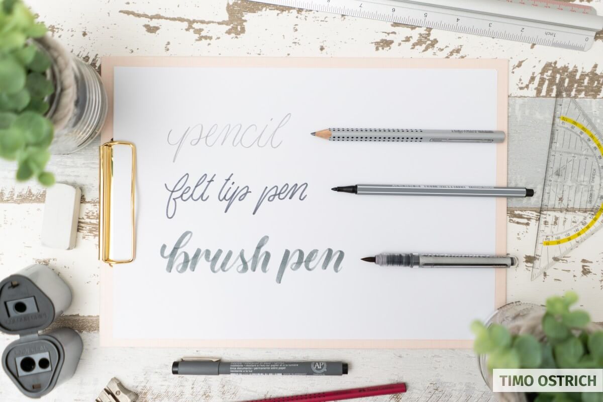
Normal pens (without a brush tip) can mostly be used on any paper. If you are using brush pens you will need smooth lettering paper. Otherwise your brush tips will fray out very fast.
If you want to know more about the different pens and paper have a look at the following pages. Otherwise let’s go on with the first steps to learn lettering now!
The first steps to learn lettering
It’s important to start with the basics. You won’t be able to draw fancy flourishes without knowing the basic strokes and letters.
A very important thing to understand is:
As a lettering artist you have to stop writing letters. You have to draw them! Line by line. You will get a totally new awareness of letters and their anatomy.
My tutorials will always teach you the important strokes first. After that you will be able to combine them to beautiful letters!
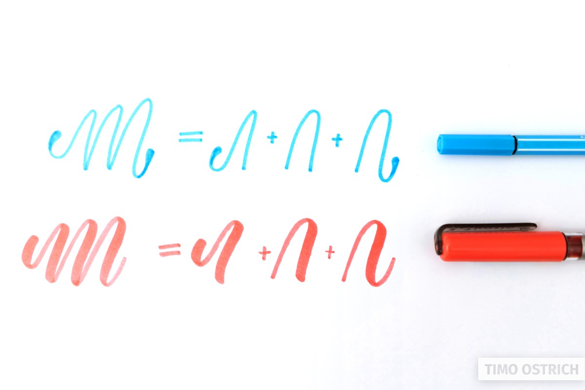
Some special training words will help you to get the right feeling for drawing complete words.
- You have pen, pencil or a ballpen? Start with the basic monoline tutorial. It is the perfect basis for everything you will learn.
- You already own a brush pen? Nice! Start with the brush lettering tutorial.
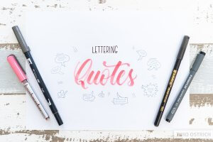
Practice lettering with quotes
Once you are able to letter fancy words and sentences you may face an unexpected problem: What to letter next?! Searching for nice words and quotes which are not too long (which makes them harder to letter) is annoying.
So if you just want to practice lettering as fast as possible you should take a look at my list of hand lettering quotes. You will find great words, quotes and sayings in the list.
Some examples:
- Beyoutiful
- Always create
- Progress over perfection
- But first, coffee
- When nothing goes right go left
And there is one very special thing about my list. It’s ordered by the number of words. That way you can choose how challenging your lettering will be. If you don’t want to choose from the list by yourself you can also use the random quote generator!
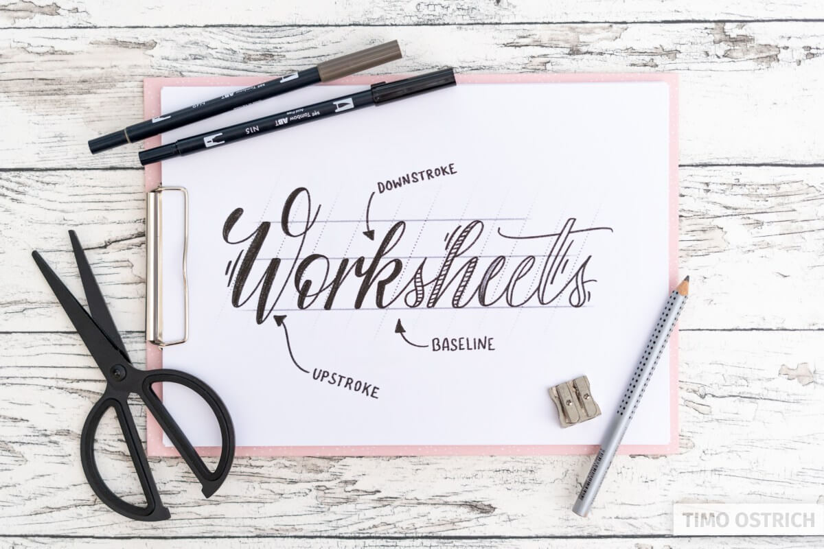
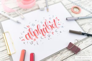
Practice with lettering worksheets
Lettering worksheets and workbooks are an efficient way to learn lettering. The premade lines help to understand the handling of the pens. By tracing the lines you will get the right feeling much faster.
If you want to learn lettering with fun, choose a worksheet and start your lettering journey!
How my lettering tools will help you
The most effective way of learning hand lettering, brush lettering and calligraphy is to use templates and worksheets. Guides and premade lines will help you to concentrate on your pens and the different strokes.
Once you used my premade worksheets you probably want to create your very own lettering. To help you drawing your very own words I developed two awesome, exclusive tools.
The hand lettering generator enables you to create templates for every word or sentence you want. You can choose different lettering fonts, arrange them as you like and finally add some decoration. Than you are able to instantly print your template.
The ruling sheet generator does exactly what it says – in an excellent way. It enables you to create ruling sheets with all the guides you need. Completely individual. For hand letterings, brush letterings or even broken letters.
How it works

Create your individual handlettering template or ruling sheet.

Save it as JPG, PDF or instanly print your worksheets.

Use your template to trace the lines (directly or on a second paper).
As easy as that! Have fun testing around.


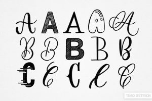
Discover beautiful letter styles
Once you learned the basics and mastered a simple cursive lettering font you are ready to discover endless beautiful letter styles. Different hand lettering alphabets will help you with that.
With all the letters of a specific alphabet on one page, they help you to practice new fonts. By drawing multiple styles you will also learn more about the anatomy of letters and you will be able to create your own styles soon, too.
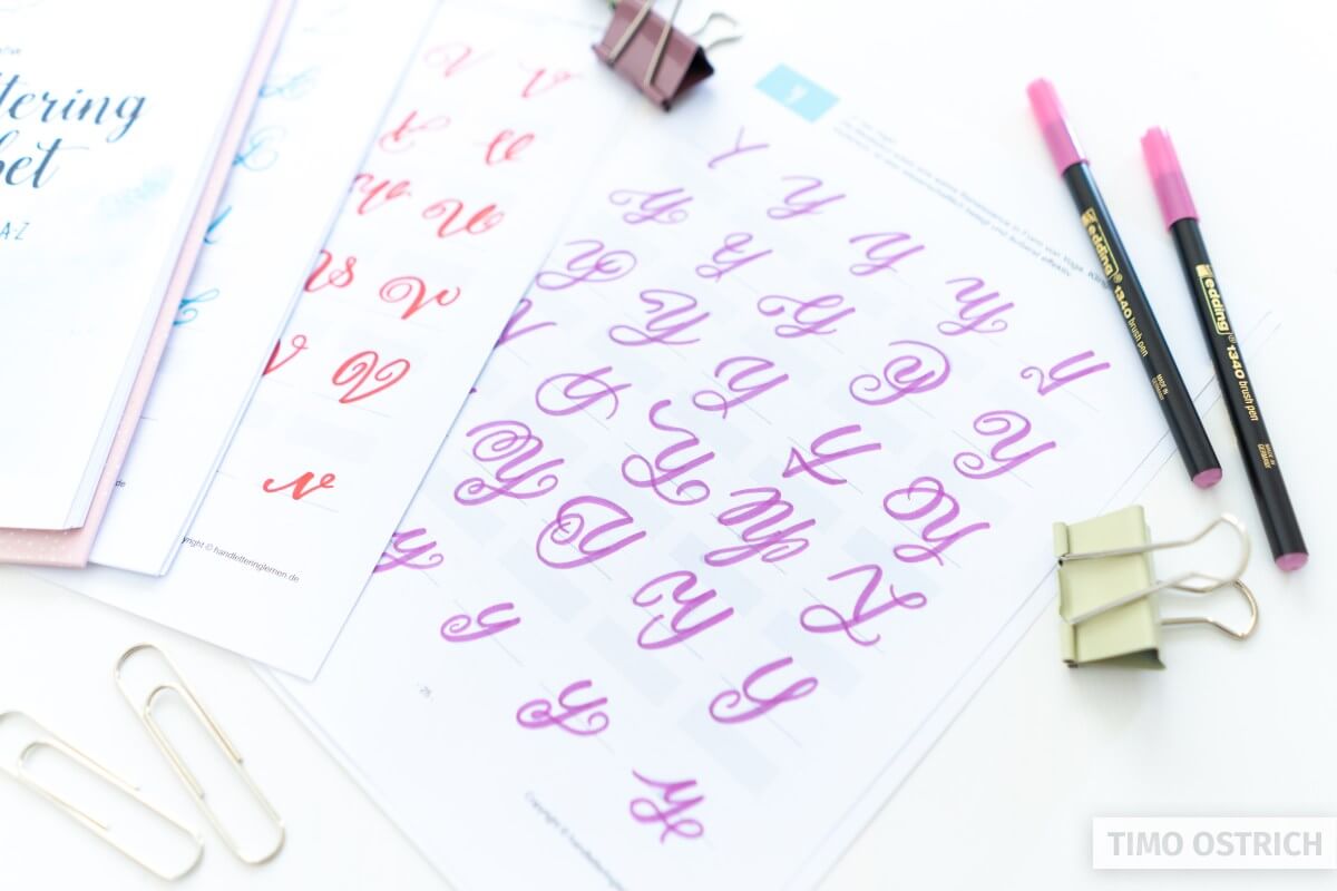
To always find the perfect style for your letterings I created the ultimate hand lettering alphabet. It contains over 700 different letter styles. Don’t miss the chance to use them in your next lettering project!
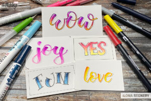
Learning new techniques
Don’t move to different styles and techniques too early. Once you are confident in the basics you may want to try differents lettering techniques. It’s a good way to develop your own style.
By combining different tools, fonts and drawing techniques you will be able to create unique lettering pieces.
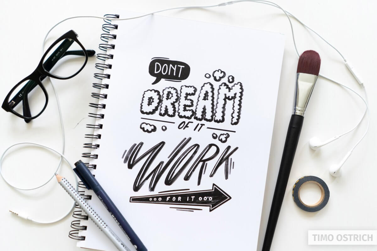
As always I want to inspire you with some hand lettering techniques I like. Have fun testing them out!


Never stop creating
The most important thing when learning lettering (and nearly everything else) is to keep on doing it!
You don’t need to work on it multiple hours a day. But you should create something nearly everyday. Even if it only takes some minutes.
Mostly you won’t see big differences from day to day. But after weeks and months you will realize your personal progress.
You should always have a look at YOUR progress – not at all the great lettering pieces you can find on the internet. It’s okay to have a look for some inspiration. But in the end you have to stop scrolling and start creating!
Where to use letterings?
In my opinion the art of lettering is one of the most usefull skills I ever learned. It’s helpful in so many different ways. Think about the following points:
- Lettering is a great digital detox. Using pens and paper is so satisfying when you have to look at displays all the day.
- It’s also some kind of meditative. When you think about the next stroke you have to draw your thoughts are completely focused on your lettering.
- It improves your fine motor skills with each piece you create.
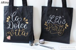
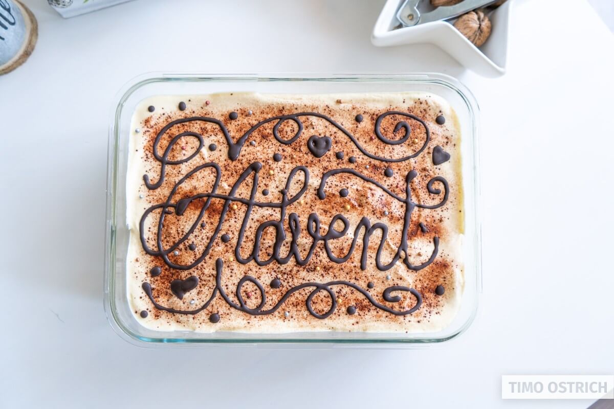
- Letterings can be used to write on paper, stone, wood, fabric or even glass.
- You will be able to create signs, cards or even your very own logo with ease.
- It’s the perfect skill to create a wonderful bullet journal
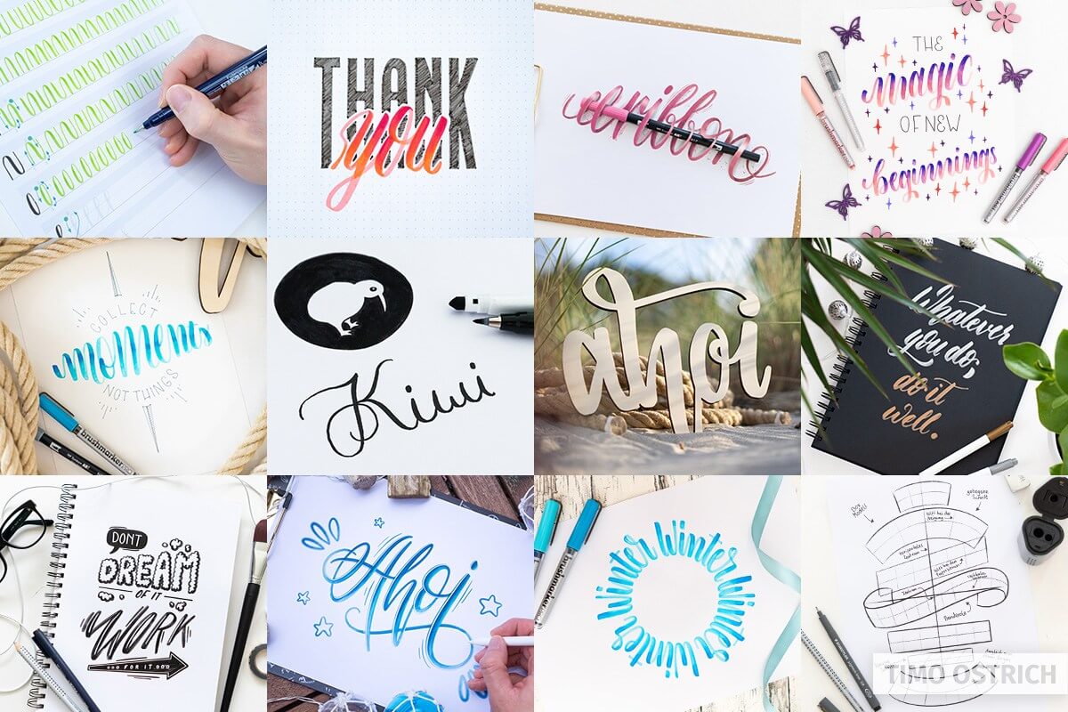
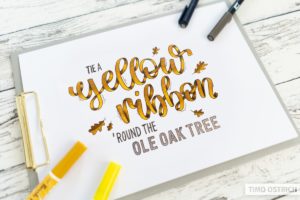
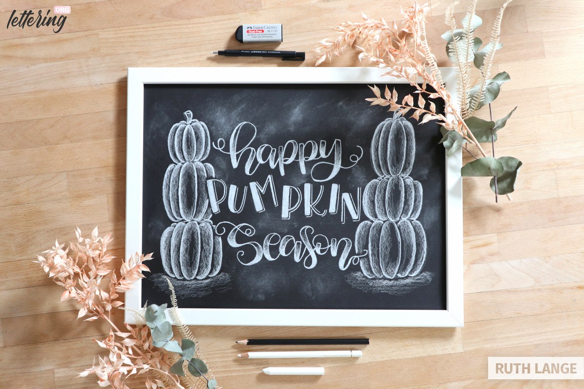
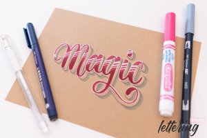
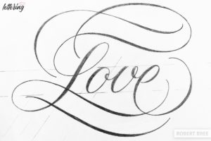
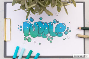
Some examples where I used letterings for different things:


So start learning, keep on training and you will master a skill which will be useful in your whole live.
About lettering.org
Hey! My name is Timo and I’m a passionate handlettering artist from germany. I love to create letterings and teach others to do the same.
Drawing letters is an awesome hobby, a very useful skill and even some kind of meditative. Once you start handlettering you will never stop again!
To make it easier for you to learn and practice hand lettering I created some sweet letterings tools, many guides and tutorials.
Any more questions? Leave a comment!
No more questions? Still leave a comment and tell me what you will learn next! 😉
Thank you so much for the detailed tips and tricks!! Awesome blog.
I really love this page it is amazing!!!!! Love it ????????????
I love this and using it for weeks now I’m trying to use it and it doesn’t have the print option even available or to darken the font how do I fix this
Try deleting your cache, there’s a new version online.
Tell me if it works! 🙂
Awesome 😎👍 I recommend this resource.
Thank you!
Is amazing all in your blog¡¡¡ thanks for all the information, Viele Danke ¡¡¡ ❤️❤️❤️
Thank you so much! Did you start lettering?
it is a very good application
Hi,
Thank you for the ruling sheet generator!
I’m using it also for my bullet journal and was wondering if you’re able to also include more formats like A5.
The ruling sheet generator is a lifesaver!
Hi Daniel, glad to hear that!
Your printer always prints A4 doesn’t it? So you could create an A4 with much whitespace at the bottom to make it fit an A5.
But adding more default formats is a good idea and on my to do list. 🙂
Hi Timo,
Thanks for the workaround and for putting it on your list 🙂
Hi Daniel,
I just released a standalone version of the ruling sheet generator and included an A5 dot grid: https://paper.click/en/a5-dot-grid-paper/
Is that what you need?
Hi Timo. The tool is great!. but would you add this symbols ¿?¡! and others ?, beacause they are mandatory in spanish language. Thanks a lot, and i am going to take some of yours courses.
See you soon.
Hi Alfredo, thanks! I will add these symbols in the fonts I created by myself in the future. 🙂
So inspiring!
I am a total beginner at lettering whatsoever. Where do I start? Looked at your books/sheets, which do I start with?
You should start with my two free guides: https://lettering.org/hand-lettering/ and https://lettering.org/brush-lettering/
heyy
tried for first time and its amazing but have only one problem that we cannot edit proportions on our own like i want for 3:6:3 so thats not available rest all is amazing. try if proportion edit can be available for us. THANK YOU
Hey, what are you talking about? The ruling sheet generator? 🙂
yes the ruling sheet generator. Please make an option to customize the proportion. As I need 3:6:3 proportion ratio.
You can choose 1:2:1, that’s the same ratio as 3:6:3, isn’t it?
Ohhh yess. Sorry I forgot the simple math. And tysm for helping.
Me encanto, quede fascinada con todo lo que lei.